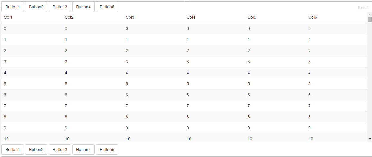
Currently, I’m working on a web project that has searchable tables. The layout requires that the search results that is displayed in the table is scrollable. The idea behind this is such that controls to perform search, paging, and other functions on the table are always in view. There are buttons above and below the table.
If you recall my previous post about CSS flex-box, you saw how you can cause elements to grow/shrink as the browser viewport changes. This seemed like an appropriate technique to achieve what is essentially a vertical fluid-layout.
The nice advantage of using this technique is that scrollable content (table) that will be within the two groups of buttons will expand and shrink vertically with the viewport size availability. This is effectively synonymous with Bootstrap’s fluid layout which primarily is used to make horizontal layouts fluid and responsive.
As an illustration, this is the layout I’m striving to achieve.
Note that table (or div containing the table) is scrollable. The basic layout is simply:
<html>
<body class="flex-layout">
    <div ui-view="main"></div>
    <div class="container-fluid">
        <div class="row">
            .. buttons..
        </div>
        <div class="row flex-scroll-content">
            .. table ..
        </div>
        <div class="row flex-buttons">
            .. buttons..
        </div>
    </div>
    </div>
</body>
</html>
In the CSS, we’re setting the flex-direction and and display styles accordingly. Also, to make all of this work, the body/html tags and most of the parent containers, as we drill through the mark-up, must have a height of 100%. We don’t really even need to set the flex grow/shrink as simply setting the parent containers to a flexible layout constrains their child elements.
The only other thing that is necessary is to set the “flex-scroll-content” to have its overflow-y property set.
Finally, here’s a working fiddle to show the behavior. It’s a scaled down version of the actual layout that I’m using. Obviously, it works better if you pop the fiddle to a full screen and play around with your browser window size.

